Thursday, June 27, 2013

Using 2 or More of the Same Photo {With Bo Bunny}

Today at Bo Bunny, some of the designers were challenged to use 2 or more of the same photos in creating a layout.  I chose to go with 3 photos and repeated this photo of my oldest daugher Chloe, printing them off in color, black & white and sepia.
 
I mixed up a few collections to get the soft romantic look I was going for here...I used paper from the new Anthem collection combined with some paper from Prairie Chic.  I used chipboard, rub-ons and brads from C'est La Vie (I just LOVE the layered chipboard from this collection!).

I also played with some mixed media stuff for this one...paints from Dusty Attic, some texture paste (home-made, recipe is in the right column of my blog) and lots of Bo Bunny Stamps.  I love the effect painting stamping and layering on texture paste gives to a page!  The blooms are of course Bo Bunny's beautiful Daisies from the 'Blush' collection. 
I added a lasercut chipboard accent from Dusty Attic (the Window with Shutters...minus the shutters :) 

Supplies:
Patterned Paper: Anthem (Celebration), Prairie Chic (Wanderlust, Rambling Rose)
Blooms: Blush Daisy, Blush Bouquet
Chipboard: Layered Chipboard (C'est La Vie), 12x12 Chipboard (C'est La Vie)
Brads: C'est La Vie
Stamps: Prairie Chic, "It Is Written" Background Stamps
Rub-ons: C'est La Vie
Paper Doily: 4 Inch (Small)
Other: Lace (off the roll), Heidi Swapp Title Sticker 
 
For more ideas on how to use the same photo more than once on a page, you can check out the Bo Bunny Blog today!  Thanks so much for stopping by! xo

Wednesday, June 19, 2013

Scrapping with Yellow! {With Maja Design & My Little Yellow Bicycle!}

When I first saw this sweet daffodil paper from the Maja 'Vintage Spring Basics' collection I just knew I had to scrap this photo I took of my youngest daughter a couple of years ago.  There is a little forest we walk in, close to our home and come Spring there are huge patches of daffodils growing in it.  Meagan always keeps an eye out, just waiting for them to bloom so she can pick a little bouquet for her room.

 
For this layout I played a little with some mixed media.  I did a little bit of masking with some texture paste and did a little stamping and dry brushing as well with some coordinating paints.

I wanted to do a little bit of misting first but didn't have the right color, so I used some Dusty Attic paint in a 'Bisque' color that I thought nicely complimented the yellows in the background paper.  I then adhered my photo to the page and dry-brushed a little more paint over the edges of my photo to kind of fade it into the background.  The next layer I added is some random stamping.  I used  text stamp from Bo Bunny and another ledger stamp from 7 Gypsies.  The final layer I added was a texture paste design in random places around the photo and in one corner of my page where I would add some extra accents.  I finished things off with some adhesive pearls by Recollections.

I wanted to use some natural/neutral accents on the page as well, so I used a whole bunch of goodies from the My Little Yellow Bicycle 'Naturals' collection.  I used the smaller of the Cork Tags, as well as the Wood Buttons (Etched), the Tiny Clothspins (words),  and the Cork Alphas.  I just love these embellishments, they can fit in with any color layout. NOTE: Just a little FYI!  My Little Yellow Bicycle Store is selling everything in it at 25% off till the end of June, you just use this code MYLYB50, so get while the gettin's good!  You can find the store HERE
 
I didn't have any yellow blooms in my stash so I made my own flowers using some yellow felt I had in my supplies.  These are so easy-peasy to make!  You can find the tutorial on how to make these in the right side panel of my blog under my tutorials.
 
Supplies:
  Patterned Paper - Vintage Spring Basics (1st of March, 8th of March-bs, 7th of April, 6th of May), Blooms - handmade (tutorial at Such a Pretty Mess blog), Cork Tag, Cork Alpha's, Natural Wood Buttons, Clothspeg (My Little Yellow Bicycle), Chipboard - Dusty Attic Designs (Small Scroll), Paint - Dusty Attic, Bird Trinket - Prima Marketing, Stamps - Bo Bunny Background Stamps, 7 Gypsies, Websters Pages Diamond Tag Stamp, Texture Paste - home-made (Recipe can be found at Such a Pretty Mess blog), Other: Lace trim (off the roll), Mask: from Michaels (Americana).
 
I just love that you can scrap so many color combinations with this paper collection!  I've done layouts in blue, pink, lilac, yellow and taupe with this collection.  Have you tried it yet?
 

Friday, June 14, 2013

Framing with Bling {Bo Bunny Design Team}

Today the design team girls at Bo Bunny were give the challenge to use framing in a creative way.  For my layout I used the new Bo Bunny Jewel Flourishes to create a unique swirly frame.  I also used one of their new background stamps to make another frame that is meant to draw the eye into the photo and at the same time frame the title.  The photo is of my niece Jade, she is such a sweet lil thing! 
Here is a close-up photo of the crystal flourish frame.  I just pasted my photo down on some Bo Bunny Vintage Dot paper (I just LOVE these papers, the make great backgrounds and accents for pages!) and then layed my flourishes around the photo.  Then I just simply cut around the flourish designs with some scissors to complete the frame.

Here is a close-up shot of the stamp frame.  I just used the corner stamp from the 'Flourishes and Such" stamp collection and stamped down my 4 corners.  I then used a black pen to draw a squiggley line and doodled squiggles on that line to link the corners.  The title sticker is from Heidi Swapp. 
 
For my bloom I used one of the Bo Bunny Denim Dahlia blooms, but in this case I took the bloom apart and used the base of the bloom and the center (I saved the middle layer for another use....it's a darker navy blue) and I cute some flower shapes from the same Vintage dot paper to layer in the middle. The two white blooms I got at Michaels in the $1.50 bargain bin, they were white and I just added a hint of blue with an old paint brush and some blue chalk ink (Versa Magic Pastels)
 
Supplies:
~ Patterned Paper (Bo Bunny Mama-razzi2)
~ Cardstock (Bo Bunny Vintage Dot - Ocean)
~ Stamp (Bo Bunny 'Flourishes and Such')
~ Bling (Bo Bunny Crystal Flourishes)
~ Blooms (Bo Bunny - Denim Dahlia), Michaels (no name blooms)
~ Chipboard - Bo Bunny C'est La Vie layered chipboard
~ Title Sticker - Heidi Swapp
Other: Home made texture paste, Ink - Versa Magic (Pastels), Lace (off the roll), Corrugated Card (Dusty Attic)
 
Thanks so much for stopping by today!  I always enjoy a nice visit! xo xo


Wednesday, June 12, 2013

A Tranquil Moment {With NEW Websters Pages 'Plum Seed' Collection}!

Webster's Pages recently put out their NEW mid-season release called 'Plum Seed'!  This collection is filled with fresh spring colors but also has some mellow contrasting colors as well.  For my layout above I chose the more laid back warm beachy colors in the collection.  I embellished using some of the Websters Pages Perfect Accents (heart, oval frame) and WP's Metal Charms, fussy cut some of the blooms from the patterned paper and finished it with some Dusty Attic Chipboard (Corner Flourish #1
Here I gave the Websters Pages Perfect Accents frame  light whitewash with some Gesso to give it a more shabby-chic finish.
 
I finished my chipboard pieces in my favorite way, first painting them with Gesso, then I gave it a good coat of a Vanilla acrylic paint (off-white), then brushed the edges with a chestnut brown inkpad (Colorbox), and then applied some Dusty Attic Crackle Varnish to each of the pieces.

The heart design is a Websters Pages Perfect Accents resin piece (it's usually in a peach/orange color) but I painted the whole thing with Gesso and then lightly brushed it with some brown chalk ink to fit in better with the colors I chose for this page.  I also added some texture/design to the page using a mask and some home-made texture paste (I've shared my recipe with you all before, but if anyone missed it, I thought I'd re-print it here).....
 
Homemade Smooth Texture Paste

1/4 cup Talcum Powder (I used Johnson's Baby Powder, Make it smell good too!!)

1 tablespoon White All purpose School Glue

1 tablespoon White Craft Paint

Some Water 

Instructions:  Combine talcum powder, glue, white paint with disposable chopsticks (or plastic spoon) in an airtight container, adding water to get it to the consistency you are looking for.  You want a nice thick texture much like toothpaste.  The mixture will keep perfectly for many months. Here is a basic step by step on how I apply it.... 

Lay your mask onto your page where you want your design to show (It helps to outline in pencil your photo placement).  Using an old credit card or a palate knife, apply texture paste onto mask in nice firm even strokes.

This is how your texture design will look when you lift the mask.  The paste dries nice and quick but if you want to speed up the process and help to keep your page from getting buckles, it helps to apply a little heat/air with a blow dryer on a low setting.  You can spray your design with mists now if you like, or rub on some inks.  I chose to just leave it white for this layout because I just thought it gave a nice contrast to the background.  Once the paste is dry, continue to add your embellishments to finish your page.
 
I hope you enjoyed my project today and hope you'll give the texture paste a try!  I just love it and I think you will too! xo

Tuesday, June 11, 2013

A Sneak Peek at 'Sofiero' {NEW Maja Design Collection}

I'm so excited to be sharing some wonderful news today from one of my design teams, Maja Design!  They are showing a little sneak peek from their newest collection coming out shortly!  It's called Sofieri, a collection that is designed around a fairytale castle in Sweden that is surrounded by beautiful gardens.  This is a 'Limited Edition' collection which means that it will have only one printing, once it is gone, it is gone!  You won't want to miss out on this one!
 
Do you want to have a chance at winning this gorgeous collection for yourself?  Then just hop on over to the Maja Design blog today and let us know what you think of the collection!  They will announce 3 winners from those that commented on June 25th!  I don't know about you, but I'm already dreaming up all the lovely things I can make with these!!  You can find the Maja Design Blog post HERE!

Friday, June 7, 2013

June ATC Theme "Collage" {Dusty Attic Challenge}

ATC's (Artist Trading Cards) are such a fun thing to work on when you are in the mood for a little creativity without having to get into a huge scrappy project!  This months theme for the Dusty Attic ATC challenge is 'Collage'.  For me the first thing that comes to mind when thinking of the word collage is a combination of designs.  So I decided to take bits of scraps of paper I had left from some of my design team work with Maja Design papers and cut little squares of paper creating a patchwork quilt design.  I then wanted to create tiny 'treasures' from the Dusty Attic 'Mini Chipboard Heart Buttons'.  I began by first painting each of the hearts with a couple coats of the Dusty In Color paints (Navajo White).  Then I gave each of the buttons a slightly different treatment.
For the above button I edged the heart with some Chestnut brown chalk ink and applied some of the Dusty Attic Clear Crackle Varnish.  Then I fussy cut a butterfly from my patterned paper and applied it to the button.

For the next button (above) I used the rounded tip of an embossing tool dipped in a soft lavender nail polish (yep! I said nail polish, it was just the right color! lol) and made little polka dots on the white painted surface.  I then edges the heart button with some brown chalk ink and again applied some of the Dusty Attic Clear Crackle Varnish.  I finished it by tying on a small piece of twine in the button holes. 
For the third button I fussy cut a tiny rose design from my patterned paper and glued it onto the button.  Again, I edged the heart with some brown chalk ink and applied the Dusty Attic Crackle Varnish.  Here is a list of the products I used.
 
Supplies:
Dusty Attic: Mini Heart Buttons, Dusty In Color (Navajo White Paint, Clear Crackle Varnish), Dusty in Bloom (Mini Roses).
Other: Colorbox Chestnut Chalk Ink, Tim Holtz word stickers, Patterned paper: Maja Design (Vintage Spring Basics)
 
If you would like to play along in this months ATC challenge and have a chance at a great Dusty Attic design prize you can find the challenge info HERE!  Hope to see you at the challenge!

Wednesday, June 5, 2013

Scrapping Our Spring Lilac's {With Maja Design}

May is the month of my dear husbands and my anniversary!  And one of my favourite things about this month is that the Lilacs are in full bloom on our anniversary weekend.  I just love to fill my house with Lilacs when they bloom because they remind me of our reception hall at our wedding.  We have this creek that runs behind my mom and dads house, and early in the morning on my wedding day, my dad went down to the creek and picked bucket load after bucket load of wild purple lilacs to decorate the tables at the reception.  We had over 350 guests so you can imagine how beautiful the reception hall smelled when we walked in after ceremony. 
 
Every year Steve and my girls pick me armloads of lilacs from our trees (we planted some beautiful French Lilac's when we moved into our house) on the weekend of our anniversary.  I took these pic's of my oldest daughter Chloe with her bouquet that she picked for me.

I used a combination of pretty purple patterned papers from the Maja Vintage Spring Basic's Collection (10th of April-bs, 11th of April) mixed with Maja's Ska vi ta en Fika? (VÃ¥ffla m björnbärssylt-bs) to compliment the purples in my photo.  The blooms I used are Recollections, Prima and the berry stalks are just loose pieces from my local dollar store. The twine bloom you see on this page is a bloom I made myself using a tutorial I saw on Pinterest Twine Blooms.

The chipboard is a Dusty Attic piece called 'Cherry Blossoms' that I just gave a coat of white paint and inked with some coordination color inks.  I also added a bit of stamping with a Prima diamond stamp from the Moulin Rouge collection, the quote stamp is a Tim Holtz stamp.

I love to cluster 'natural' style elements around the title.  Here I used a Prima nest and blooms and added some lace and feathers mixed with an extra snippit of chipboard.  The clock is a trinket I found in the clearance aisle at Michaels.  The title is a Heidi Swapp sticker.
 
Sadly, the lilac's are pretty much finished in the last few days....so I guess I just have to look forward to next year now (or enjoy the pic's I took!)  :) 

Oh! before I forget! I wanted to share with you all the June Mood Board from Maja Designs.  This is another inspirational board designed to help you create a beautiful and unique scrap project.  It's full of lovely photos, great color inspiration, quotes and descriptive words to help you on your way.  Each month Maja hosts this challenge and ask that you share with them your Maja Design projects you create using this board.....a great Maja Design package of your choice is always up for grabs for the winner of the challenge....

 
For more details on how to play along in the challenge as well as some examples from our amazing design team you can check out this link Maja Design June Mood Board Challenge.
 
Thanks for stopping by today and checking out my latest Maja Design project! xo

Saturday, June 1, 2013

I'm This Month's Guest Designer at Scraps of Elegance!!

I was so delighted when I received my guest design team package from Scraps of Elegance Kit Club for the month of June!  This kit was packed with gorgeous papers (2 of each! love that!) and so many beautiful and fun embellishments and mixed media elements as well!   
 
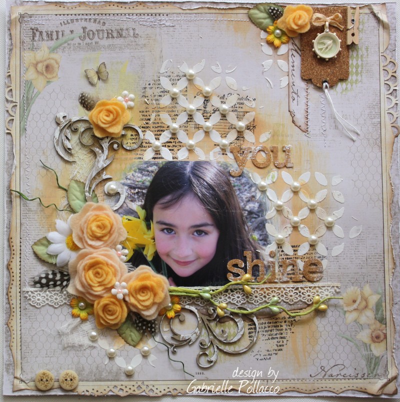
For my first project with this kit I made this layout of one of my daughters (Chloe) and her BFF Peyton.  I made it according to the sketch design for June.  The sketch is made by their talented sketch designer Suepup!  Here is a copy of her lovely sketch (below) 

I love the way SOE combines many different paper collections (there are 3 in this kit) and has them all matching perfectly!  Sometimes it's not easy to match pink tones, but each paper is a perfect compliment to the other in this kit!  I love the Prima blooms in this kit, so I combined these with some fussy cut flowers in the Websters Pages papers.  I added a couple of Dusty Attic chipboard pieces to finish off the page (an ornate frame and a corner vine).  For the frame, I painted the whole thing white, then gave the edges some soft distressing with some brown chalk ink and then used a pearly white 3D paint (Scribbles, found in the Tshirt section at Michaels) to give the frame a resin look.
Don't you just love these shabby-chic little tags in this kit?  They come blank so that you can add any design that you like to them.  For this page I just cut out a small rose design from one of the patterned papers and glued it to the tag.  You can use stamps and rub-on's as well to decorate these tags! 
Here's a close-up of the Dusty Attic vine corner I added tot he page.  For this I kept it really simple and just used a green ink pad to tint the piece, a super easy way to color an very intricate chipboard design.

There is also a package of these cute cute music note paper clips from Prima's Lyric collection in the kit.  I dressed up mine with a couple of adhesive gems.

For my second project I used this really cool Crafter's Workshop mask that was in the kit.  It has a fan shape with a vine/flourish design.  This combined with the awesome Lindy's Stamp Gang Starburst spray (also in the kit) inspired me to create a mixed media style page!  I began my design by first doing some random stamping on the page with some script/text stamps from my stash (Bo Bunny background stamps, 7Gypsies Distress Stamps).  I then did some random spritzing with the Lindy's spray (around the area of my photo placement) and added a little bit of Donna Salazar Mixed Media Distress Ink (Honey). 
I then took the Crafters Workshop mask and using the home-made texture paste recipe (you can find the recipe in the side column of my blog under tutorials), I applied the paste to the mask, allowing bits of my stampwork to show through underneath.  I added a bit more spray and ink with the paste dried. 
In the photo above you can see how I used a rub-on to add a coordinating design to the Tim Holtz tag from the hit.  There is also some really fun color chipboard in the kit, I love the polka dot arrow design in the chipboard collection included in the kit! (the title is a sticker from my stash - Heidi Swapp). 
I added a couple of chipboard pieces from my own stash as well.  The circle frame is Dusty Attic as is the vine/flourish....the flourish is acutally a corner flourish that I cut to suit my page design.  I again ust inked the piece with green ink and edged with a chocolate brown.  I then used Dusty Attic Gloss Medium to add a glossy texture...I applied it randomly rather than in one smooth finish.
 
And finally I made this page using one of the pretty patterned papers in the kit from Prima.  My husband and I celebrated our 33 wedding anniversary last week and I wanted to save the beautiful cards I got from my girls and my dear husband, so I made up this page, with a pocket on the back inwhich I could keep the cards.

There are some cute butterflies in this kit from the awesome and talented Renea Bouquet (Renea Harrison) in this kit!  I used one of her butterflies and the actual packaging (the black flourish design above the photo) to decorate the page. 
I used a used a small chipboard accent from Dusty attic to underscore the photo (again, just painted white, edged with brown chalk ink and finished with Dusty Attic Crackle Medium)
 
If you would like to get your hands on this gorgeous June Kit, you can find more information on the kit HERE.  I know you'll enjoy it as much as I have!
 

LinkWithin

Related Posts with Thumbnails