Pages

Friday, July 29, 2011

Bo Bunny's Fast Friday!!

Okay, I have to admit, I'm one of those scrappers that takes their time with each and every page.  I used to rush and feel frustrated when I couldn't get a page done as quickly as I wanted to.  But finally I came to the realization that I actually enjoy the creative process and now I let myself enjoy it rather than make myself feel frustrated that a page is taking me so long.   BUT,  I know that there are many scrappers out there that just don't have the luxury of a lot of time to scrap, so getting a page done in a minimum amount of time is of key importance to them.  Bo Bunny challenged some of the DT girls to do a page for Fast Friday, that is to say, create a layout in an hour or less. 

I challenged myself to see if I could make mine in 45 minutes......I didn't make it......BUT! I did make the above layout in 1 hour! (I had my girls time me to keep me honest lol!)  Here are some tips in getting a page done quickly:

~ I started by choosing an old l/o of mine that I liked the design of and chose to copy the design (I find a lot of my scrapping time is spent on creating the page design and positioning my embellishments. Working off an old l/o helps cut off loads of time.

~ On my original l/o I did a lot of machine stitching, for this one I simply used a brown and black pen to immitate the stitched lines.

~ I often make my own blooms for my layouts, in this case I used ready made but you can also create your own in colors that you often use and keep them ready to go in a jar.

~ Gather together all your components for your layout and have them ready to go, it's easier if you stick to one collection's papers and embellies if you really want to work quickly.

~ Be organized. If you pull a pen or scissors etc. from your tool jar, put them back when you finish with them, I can't tell you how much time I waste looking for my tools under scraps of papers and embellishments!

~ I often save the backing to flourish stickers/chipboard and use them as masks, I keep them in a handy little zip-lock back within easy reach.

Here are a few close-up pic's of the above layout....


Bo Bunny supplies used to make this layout:
Patterned Paper: Vicki B: Floweret, Perky
Noteworthy: Vicki B: 3 styles (matting)
Chipboard: Vicki B
Stickers: Vicki B
Trinkets: Vicki B
Brads: Vicki B
Trims: Vicki B
Stamps: Timepiece & Flourish set
Jewels: Vicki B
Blooms: Olivia

If you want to see more examples of layouts made in under 1 hour, check out Bo Bunny's Fast Friday post for today, the DT did some amazing projects in under an hour!  Happy Weekend everyone! xx

Thursday, July 28, 2011

Free Digi Frames from Webster's Pages!

Hi Y'all!  I just wanted to do a quick little post to let you know that there are more gorgeous digi frames available from Websters Pages ~ FREE!! for you to download!  There are a bunch of selections for each of the new collections Websters Pages just released at the summer CHA!  The one I used on a profile pic of me (above)  is from the Western Romance collection!  I showed you a few that were available that complimented the early release collection called 'Lets Celebrate' a few weeks ago...here is one of the frames that I used with a pic of my girls.....
You can find all of the frames here Websters Pages FB Frames ....all free to download!  They are easy to use if you have any sort of photo-editing programs.  To frame the above photos all I did was open a new canvas in my photo-editing software (I use Photosuite by Roxio), click 'insert photo/image' to pic a photo, and then click 'insert photo/image' again to choose one of the frames you downloaded and lay on top! Done!  Believe me, I'm no expert in digi but I was able to manage this easy peasy! :)    Thanks Brandin for these awesome freebies!!


Tuesday, July 26, 2011

Rose Creations Tutorial & 2 Websters Pages Layouts!

I made this layout of my niece Jenny singing, using a combination of papers and embellishments by Webster's Pages (Ladies & Gents, Magical Wishes, Hollywood & Natures Storybook), the trims are from WP Hollywood Collection, the Netting & Cameo (Silhouttes) of course is Websters Pages.  The alpha's are my favourite...the scripted alphabet stickers from Websters Pages!!....and hey! did you notice???  The newest collections from Websters pages have these gorgeous scripted fonts back again!!  I am sooo happy about it!!  I know a LOT of you are too considering all the emails I get asking where I get my title alphas! :)

The Chippies are of course Dusty Attic!  Both the circular frame and the scroll design, which I again finished with some white paint, brown chalk ink and a little stamping.  I coated both of them with Tim Holtz Rock Candy Crackle medium.   The blooms are more roses that I handmade using the Rose Creations die cuts by Spellbinders.  (Tutorial will follow)  Here are a few close-up pic's of the page...
I had this tiny bit of Webster's netting left over from a previous project and stitched it into the corner of my layout....I have to admit, I think that I was a bit influence to make this move because of having recently viewed that GORGEOUS page by Jeni O'Connor where she used some of this trim on the edge of her page...thanks Jeni! xx


~~~~~~~~~~~~~~~~~~~~~
ROSE CREATIONS TUTORIAL!

Okay, I promised I would share a little tutorial on how I made the yellow roses for a Webster's Pages and Bo Bunny layout I made a while back and since I was making more of them in pink for the above layout I thought I'd take pic's as I went along to show you how to make these.  Here is what you will need to make these roses:
I have a Quickutz Revolution Die cutting machine, and I was so happy to find out that I can use these die cuts with my machine!  I believe they can be used on most die cutting machines but you may need inserts with them for some other machines.  For the Revolution you can use them 'as is'.  There are 6 flower shapes in this collection ranging from small to very large.  I used the 4 smallest bloom sizes to make my blooms.

Step 1 ~  Cut one of each of the 3 smallest petal designs, but cut 2 of the larger one (using light pink carstock).  Ink the smallest cut and just the centers of the larger ones (you don't have to have perfect fading just ink in the center)

Step 2 ~ Take each of the petals and with your right hand press your thumb in the center, with your left thrumb and forefinger pinch the petal in a V and puch toward your right thumb (as shown above)  Note: you can very lightly mist your paper with some water to make this step a little easier.
The smallest flower cut will be a little different, you will put the 'good' side down and just give each petal a little cure (see below)....this will create your bud.

Here you can see what the petals will look like when you are done shaping them (Note the smallest shape is a little different, you simply curl each petal up a bit, this will be your center bud).  Add glue to your shapes.  I put the glue up high on the smallest petal so that when I wrap it around the brad it will create a nice tight bud.  I bring the glue high up the petals on the second smallest bloom size also because this one needs to hold tight around the bud.  For the rest, a simple circle of glue at the base will suffice.  I like to use the Tombow repositionable/permanent adhesive, if you let it dry slightly it stays tacky and will allow you to play with your design a bit.

Step 3 ~ Take your brad, it can be any old brad because it will be hidden in the end.  Push it through the hole in the petals center and wrap the petals around the brad. See above...


Step 4 ~ Add the next size up die cut and wrap the petals around the bud.  You will then continue with the rest of the petals moving up in size each time.  Arrange your petals so that they do not all run the same way, alternating the petals so they overlap.  Done!  The finished blooms will look like the ones below....

I made some variations in color and size for these blooms.  For the partial pink and white blooms I changed the large size and next size down die cuts to a white cardstock and lightly inked the centers with some soft pink chalk ink.  For the buds (smaller roses I used the following steps & cuts)....
~~~~~~~~~~~~
I have one more layout to share with you all using my Webster's Pages goodies.....I thought I would get some more pages done before the newest collections get here!  This is a photo I took of Meagan at the beach, she was sitting there gathering sand around her legs, and we got the idea to turn her into a mermaid.  I used some Websters Pages Yacht Club & Country Estate papers to make this page, along with those fabulous WP Bloomers, Princess Petals & Alpha's.  The corner flourish is Dusty Attic.


I got confirmation on my Webster's Pages package, so I'm ready to stalk the mailman lol!  Can't wait to play with the new collections!  I hope your local scrapstore owners went to CHA armed with lists for these gorgeous collections, so that you all can play along with me! xx

Wednesday, July 20, 2011

CHA is on and Webster's Pages Has Some Gorgeous new collections!!!

I just love this time of year, seeing all the beautiful new collections being revealed at the Summer CHA!  I was away on a summer vacation during Webster's Pages big Promo week for their newest collections so I hadn't had a chance to share all these peeks at what's coming out.  But for those of you who still haven't had a peek at these gorgeous goodies, here they are.....WARNING:  You may need to put on some shades, their newest bling embellies are spectacular! *smile*


~~~~~~~~~~~~~~~~~~~~~~~~~


~~~~~~~~~~~~~~~~~~~~~~~~~~~


~~~~~~~~~~~~~~~~~~~~~~


Aren't they beautiful?  And  they didn't stop there of course, the embellies are again, amazing!!  Check out the dazzeling bling and the adorable Cameo Pins! Love them!!


.....And then of course there is always my fav, the trim cards!  Here are a couple examples of the beautiful trims Websters Pages has to offer (feathers and lace! oh my!).....


Bling, feathers, lace and gorgeous papers!  Can't wait to get my hands on all these lovelies!   And can't wait to see what you all create with them!  For a little peek at some projects made up by the WP design team, be sure to have a peek at Brandin's blog


Tuesday, July 19, 2011

Focus on Bo Bunny Die Cuts....

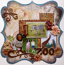
I just love mixing collections and for this assignment I was asked to feature one of the Bo Bunny Die Cut papers. I picked the beautiful die-cut from the Mama-razzi collection and combined it with the new Zoology collection. I've had a load of photo's from one of Meagan's school trips from a couple of years back and so finally have a great collection to scrap them. One thing I really like are the 6x6 paper pads, they are just perfect for those matt papers for behind your photos and really a cardmakers dream! Here are some closeup pic's of the above page.....


How cute are those layered chipboard stickers!  I think they make such a fun embellishment for a Zoo page!  I also used some of the Zoology Chipboard, Trinkets and Jewels (bloom centers).  Check out the Bo Bunny Blog post for today for more beautiful die-cut layouts made up by our design team members!

Okay....just a couple more days until I post a winner for the Blog Candy Giveaway so don't forget to leave a comment in my last blog post to have a chance to win!  :)