Pages

Wednesday, February 27, 2013

VIDEO TUTORIAL: Vintage Dress Canvas Using Maja Design Papers & Dusty Attic Chipboard!

I get some really lovely comments and emails from you sweet ladies out there and one of the things I hear is that you'd like to be a fly on the wall while I'm creating a project!  Well, you'd have to be a very patient fly because my projects can sometimes take a while! lol!  But I also know that I really like watching these 'watch the process' videos, so I thought I would create another canvas, this time using the gorgeous Maja Design collection called 'Ska Vi ta en Fika' and some Dusty Attic chipboard pieces.  I just love this paper collection, here is a little peek at it if you haven't seen it yet...
So without further ado, here is my video tutorial for my Vintage Dress Canvas!  Grab yourself a cup of coffee, sit back and enjoy!

 
I hope you enjoyed my tutorial!  Here are a few close-ups in closer detail. 
   
 
I'd love to hear what you all thought of the video and also what sorts of tutorials you would like to see in the future on my blog.....I love getting your feedback!  Would you like to get your hands on some gorgeous new Maja Design collection papers?  Be sure to stop by my blog on March 1st, I've got an exciting announcement for you all!!


Tuesday, February 26, 2013

Using Washi Tape with NEW Websters Pages *Modern Romance*!

I often like to randomly ink the areas behind my photos when making a layout so I thought it would be a fun idea to try using Websters Pages new Washi-tape in torn strips to create a similar effect.  The cool thing about the particular tape I used here is that it has a pattern that can be lined up as you go!  Here are a few close-ups of the page...

I used one of the digi journaling boxes to make the above frame for my text.  Yep, I'm gonna get all braggy again here :)   I took this photo of Chloe a few months back on her first day of High School (gone are the days when you would dress them up in their finest for the first day of school....now it's shorts and casual wear lol!)......But I was so proud a few days ago when Chloe brought home her first semester report card, she got a 94%  grade point average for all her classes! Including French, English, Math and Art)  I couldn't be more proud! 
Do you like the blooms?  I was so happy to find them in the $1.50 bin at Michaels!!  4 blooms to a package!  I was so thrilled with this find!  And the colors where just right for the WP papers!   Thanks for stopping by today....and I hope you'll be back tomorrow, I've been busilly working on a new canvas tutorial!!  

Monday, February 25, 2013

Websters Pages *Composition and Color**

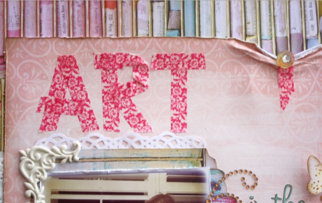
This cute collections called Composition & Color came out a few months back as a mid-season release meant mainly for the more 'Clean & Simple' style scrappers but I just fell in love with that cute cute pastel chalks paper and the lovely woodgrain design as well.  So I just had to make a layout using these papers.  I also wanted to play a bit with the new Washi Tapes as well.  For this page I thought I'd try using it for making part of my title...
I kept the design more rough looking since I was doing the word 'Art' ...I wanted to give it a kind of homespun look.  A quick and unique way to do a title right? 
I just added a few embellishments (Websters Pages Princess Petals, Bloomers and Designer Trims (kitchen twine) and cut out a couple of the chalk pastels as accents to finish the design).  The photo is one of my little great nieces getting into painting.  I'm so happy to see that they enjoy crafting and painting as well!  Come back tomorrow to see how I used Websters Pages Washi Tape with their Modern Romance collection!  Thanks so much for stopping by again! xo 

Friday, February 22, 2013

Websters Pages Digi {Quick an Easy Pages}!

I'm not normally a digi scrapper but I really wanted to give some digi pages a try using the newest Websters Pages Digital collections.  Did you know that all the Websters pages paper collections can also be found in a digital version?  And not just the papers,....buttons, embellishments, rhinestone titles and flourishes...so many cool things!  Above is a layout I made using the New Beginnings Digi collection. 
 
Even if you are not a digi scrapper, what I like about this is that you can use this as a way to layout a page design, almost like a sketch that you may want to try with the real papers.  Working in digi allows you to move things around quickly, try different patterned papers together so without having to chop up your real papers until you're sure you like the design.....I just might give these combinations a go with the real paper collection.  Below is another one I put together using New Beginnings Digital kit.  My daughter Chloe has such beautiful hands with perfectly shaped nails (unlike her mama who keeps her nails clipped short!)....and she loves to do fun nail pollish finishes.  The design she has below she painted the nails with a dove gray polish and asked if I'd put on some white polka dots....I readily agreed ....but halfway through I realize what a tedious task I'd agreed to!  But in the end it really looked cute! :)
 
If you are interested in checking out the digital kits you can find there here WEBSTERS PAGES DIGITAL.  You can purchase the designs in seperate formats or as a whole kit with everything in it.  And the beauty of digi is you can use it over and over!  There is also a nice 'freebies' section where you can download some beautiful frames, journaling cards and lunchbox notes!  (I even use the digi designs for my signatures at the end of my blog pieces....below, I used the In Love digi collection).  And before you all ask, nope, I'm not going digi! lol....I've got loads of new pages and a new canvas tutorial to share with you this week so please pop by again! xo

Friday, February 15, 2013

Water-color Effects with Bo Bunny's Isabella! Paint Tutorial!!!

Photobucket
I really love the soft and feminine look of the NEW Bo Bunny Isabella collection, and in keeping with this soft look I thought I would do a water color effect on the page.  Here is a little pictorial step by step in adding the water color design.... 
Step1:  Position your photo where you would like it placed.  Begin by sketching out 4 petal blooms and connect with branches and leaves.  Use a permanent fine tip ink pen....I took a few of my black pens and tested them on some paper to see which would run least when hit with water. 
Step 2:  Water down some white acrylic paint (I used Dusty Attic Navajo White) and fill in the flower petals, try to allow some of the printed paper design underneath to show through.
Step 3:  Water down some pink acrylic paint (I used Dusty Attic 'Dusty Pink paint) and lightly brush onto the flower from the center fading outward. 
Step 4:  Use a chalk ink pad, preferably one that has a pointed tip (I used the Colorbox Charcoal inkpad) and rub around the outer edges of the petals to give a shadow effect and allow the blooms to pop off the page some. 
Here are some close-ups of the finished page.  I simply added some adhesive pearls to the flower centers to finish them.  The larger flower is from Bo Bunny's Daisy (blush) collection, the smaller ones are handmade from Bo Bunny Double Dot Tutu paper using the Spellbinders 'Rose Creations' die cuts (the two smallest die cuts). 
 
Supplies:
Patterned Paper: Isabella (Divine, Savvy), C'est La Vie (Domino-reverse side)
Cardstock: Tutu Double Dot (matting and small blooms)
Brads: Isabella
Blossoms: Daisy (Blush)
Jewel Flourishes: Chocolate Jewels
Stamps: Distressed Textures Stamps
Paper Doily: Small
 
It was really easy to add this unique touch to this layout using a simple black pen and some acrylic paint!  I hope you give it a try!


Wednesday, February 13, 2013

Maja February Mood Board Challenge - Pulled edge Tutorial

Every month Maja Design has this really cool Mood Board Challenge going....it's a really fun and inspirational board that suggests colors, text, embellishments and moods.  This months mood board was made to work with the Vintage Summer Basics collection but there are many other Maja Design papers that work really well with the mood board as well.  I just love using the mood board to inspire a page.  I loved the feminine pretty photos in the mood board and I chose a number of the words to use on my page like 'lace', 'pearls', 'shades of misty rose', 'pale peach', 'beauty', 'flowers' and 'shimmer'.   And what a beautiful poem, just the thing to put you in the mood for scrapping! Here is the mood board for February if you want to play along (there is a beautiful Maja collection up for grabs for the winner!! See challenge rules at this link Maja February Mood Board Challenge
 I wanted to get a nice soft feminine effect on the page so I started out with 2 layers of patterned papers from the Maja Design collection called 'Vintage Summer Basics' (1908-bs, 1921, 1925) and some torn strips from the 6x6 paper pad from the same collection.
Although I had these pretty new papers to work with I wanted to be practical and use some of my older stash as well.  I have all these lovely rub-on's that I've been hoarding from my days on the Daisy D's design team and I figured I will eventually have to stop hoarding and use them right? lol. 
 
The 'Life is Good' title is from one of the Daisy D's  rub-on sheets and the white lace design is a rub-on from another Daisy D's rub-on sheet I had. 
I first did a little bit of inking with a make-up sponge and some Tim Holtz Victorian Velvet Distress Ink, I think it's the perfect color to match the pinks in the Maja collection.  This also allowed the white lace rub-on to show up better on the patterned paper.  Here are more close-ups of the page....
Now I have to let you know that I've had a number of people ask how I get the paper to pull down when I do those little peek-a-boo edges.  Sometimes it's just easier to do a little video tutorial than to explain it.  So I got my oldest daughter to hold the camera while I recorded a little piece for you to see how I do it.  I have to appologize in advance about the sound quality on this video piece, my daughter taped it with my phone camera and I'm thinking she may have had her hand over the speaker while taping some parts.  But I think you'll still see how easy it is to do when you watch the clip....

Here is another close-up of one of the pulled back paper edges.  The key for sure is that you want to use a nice heavy weight paper that can take the paper manipulation...and you can find that in the Maja Design papers, they are a great quality paper!
 And finally I wanted to mention the lovely chipboard pieces I used on the this page.  The loopy sweet vine you see on my page edges is a new one from Dusty Attic called 'Swirly Vines #3' and the floral chippie that I used to frame my photo is one called 'Floral Corners' that I cut up so that it would wrap around the photo.  Below are a couple of steps is did in making up the frame design.  The actual first step is to paint your chipboard white and then tint the leafy areas with some green chalk ink.  Then you want to glue your chipboard pieces to your layout.  Continue with the steps below...
I like to fill in the petal areas with a bit of Glossy Accents after the Stickles dry just because I find the Stickles dry fairly flat and I love the thick glossy look they have when they are wet.  Adding the Glossy accents keeps that glossy thick look to the petals.
 
I hope these tips and tutorials have helped!  If you every have any questions and would like to see a demonstration of techniques I use on my pages just leave a comment and ask....I'll see what I can do about getting tutorials posted.  And if you would like to play along this month in the Maja February Mood Board Challenge you can find the rules for the challenge there as well (the main rules being that you please resize your photos to 600x600 pi and that you not put on any watermarks for the challenge page entry....also that you must use some Maja Design papers to enter the challenge).  We had loads of entries last month and look forward to seeing your creations this month as well!


Monday, February 11, 2013

How to 'Catch' Your Dreams!

Hi Everyone!  It's me, Gabi here with you today to share my project and tips for February! I fell in love with this Dream Catcher #1 chippie the minute I saw it! (there is also another beautiful Dream Catcher design available as well)....I just loved the fine detailing in this one!  When I got this sweet photo of my adorable great niece Jade with her cute piggy-tails and faux-fur vest, I knew this chipboard piece would be the perfect accent for my page.  I thought first off I would share a small step in prepping my papers before I started embellishing this page.  I cut two layers of complimentary papers, for this page I use papers from Maja Design from their Walk in the Forest collection (top paper is cut about 1 centimeter in from the edges) and edge distressed with my Tim Holtz Edge Distressor tool.  
I then did a little dry brushing with some of the new Dusty Attic Paints (Oceania, Mountain Meadow).  I then added random strips of scripted Washi tape on two edges (Tim Holtz Washi tape), slightly crinkling the tape as I went.  The third step was to do some random machine stitching (see above).
 
I then prepped my Dream Catcher chippie using the following steps: 
Step 1:  I gave the whole piece two coats of the Dusty Attic Navajo White paint.
Step 2:  I used some brown chalk ink (Colorbox - Chestnut Brown) to softly ink all the edges....be gentle with your piece as you are doing this as the piece is delicate. 
Step 3: I took a brown ink pen (I used the Martha Stewart detailing pen) and just doodled in a bunch of detailing on the feathers and twine designs.
Step 4:  I thought it would be fun to add some 'real' dream catcher detailing to the piece by stringing some seed beads on a piece of wire and attaching them to the loops in the chipboard (see above).  I also added some real feathers just beneath the chipboard strands when I glued the piece down. 
Here is some close-up detailing on the bottom of the Dream Catcher.  I used some aqua beads with silver accents to stay in keeping with my page colors. 
Here's a close-up of the upper portion of the Dream Catcher.  I glued some random seed beads over the netting part of the chipboard to give the piece a more authentic look. 
I did a little bit of stamping in the bottom corner with some wildflower stamps an added my title rubon over the painted area.  I added some floral and twine accents as well as a small Dusty Attic Postage Stamp chippie simply glued on in it's natural state. 
And here are all the Dusty Attic Products I used on this page:
Chipboard:  Dusty Attic Dream Catcher #1, Postage Stamps, Corrugated Card
Paint: Dusty Attic Paints (Navajo White, Oceania, Mountain Meadow)
 
Before I finish up my post for today I thought I would also show you a little ATC I made up for the February ATC challenge over at Dusty Attic.  This months theme is 'Love'.  I used the postage stamp chippie as well as the Lock & Key chips for this project.  The papers I used are from the new Websters Pages 'Modern Romance' collection and the lacy heart is from the Websters Pages 'Designer Threads' embellishments package.
 
There are so many new and wonderful chippies in the new releases, I hope I've inspired you give this one a try! 

Friday, February 8, 2013

Have You Seen Mama-Razzi2 from Bo Bunny??

I was just so in love with the Mama-razzi collection when Bo Bunny first came out with it a couple years back and it's one of those classic's that I find myself reaching for over and over again.  So you can imagine how excited the girls on the design team were when we were told that Bo Bunny was putting out Mama-Razzi2 at the Winter CHA!  A new selection of papers and embellishments that are sure to please the photographer in all of us!  These papers and embellishments work so well for both feminine and masculine style pages!  I've been hanging onto this cute photo of my friend/neighbours little boy and his puppy (Chloe took this pic with her phone, believe it or not! I just thought it so nicely captured the joy of a boy and his pup!)....and when I saw these papers I knew I'd found the collection to scrap this pic!  Here are some close-ups of the page elements... 
I used some of the pretty layered chipboard, brads & buttons and some of the new Bo Bunny Blossoms (In Clover green) to embellish the page. 
Supplies:
Patterned Paper: Mama-Razzi2 (Strike a Pose, Shutterbug, Mama-razzi2, Focus)
Chipboard: Mama-Razzi2 12x12 chipboard, C'est La Vie 12x12 Chipboard (alphas)
Buttons: Mama-Razzi2
Brads: Mama-Razzi2
Trinkets: Mama-Razzi2
Lace: Bo Bunny Clover Lace
Blossoms: Zinnia (Clover)
Stamps: Stained Textures Stamps,
 
If you want to see more beautiful pages made with this new collection from Bo Bunny, be sure to check out their blog post today, our design team created some beauties! xo