Pages

Wednesday, March 27, 2013

A Little Spring Whimsy And a Video Tutorial: How To Make Your Own Crinkle Ribbon!!

I have some really fun stuff to share with you all today, including a very quick Video Tutorial on how to make your own inexpensive handmade Vintage Crinkle Ribbon!! (scroll down for tutorial).   I was so thrilled to be working on my first project using the NEW and gorgeous Vintage Spring Basics collection from Maja Design! I'm such a huge fan of butterflies, birdies and florals on my scrapbook papers, and add them to a vintage design and I'm in heaven! I wanted to go with a butterfly theme so I thought I'd create a layered butterfly wing design to accent the page. I thought I would share with you all the steps I took to create the butterfly design... 


Before I added the larger wing to my page, I first lightly inked some of the area around where the wing would be placed and did a little stamping with some script stamps. I wanted a 3D layered effect so I glued down the larger wing and did a little doodling around the edges of the wing and then glued down the smaller wing on top, glueing only at the center of the wing so that it can be folded up slightly. Here is a close-up view of the finished design...  
I also wanted to try something fun for this page, and it was to make my own Vintage Crinkle Ribbon! I've seen these cute vintage looking ribbons on many projects in the past and when I went to source them locally I had an impossible time finding them! Then I came across some information on Pinterest on how to make these vintage ribbons from seam binding! I gave it a try and it was easy-peasy to do and so inexpensive! 
 
This is what you will need to make these ribbons:
~ Seam Binding (100% Rayon works best but I could only find Polyester and this worked for me)
~ Tints: Tim Holtz Distress Ink Pads (in the color of your choice - I used Victorian Velvet), you can also use the Tim Holtz re-inker bottles for this as well.
~ Water Spritzer
~Elastic Bands
~Waterproof surface (I used the top of one of my Iris Storage boxes)
Click below to watch a less than 3 minute tutorial on making these.

 
Just a note:  This method of tinting the ribbon gives a really nice aged look to the ribbon and some areas will tint slightly darker than others, this is a good thing!  It helps in giving the ribbon that vintage look we're going for! :) 

I also added some Dusty Attic chipboard in the lower right corner to mirror the cherry blossom design in the papers. These I handpainted and I added a little nest to give a nice Spring feel to the page.
And I have one more little extra for you today. I know that not everyone is comfortable with sketching, so if you want to try the butterfly wing design that I created above, you can right click on the template below and 'save picture as' to your computer. I saved the page as a 8.5x11 so when you go to print if you hit 'fit to page' it should give you the wings in the same size as I created for my page.
I hope you enjoyed my first project with the NEW Vintage Spring Basics collection as much as I enjoyed making it! And don't forget, if you want to have a chance at winning this gorgeous new collection, you still have a few days left before the end of the month to enter at my blog! You can find the GIVE-AWAY at this link MAJA VINTAGE SPRING BASICS GIVEAWAY!
 
Supplies:
 Patterned Paper - Vintage Spring Basics (1st of May, 4th of May, 7th of May, 7th of May-bs, 6th of May), Chipboard - Dusty Attic (Cherry Blossoms), Flowers - Dusty Attic Mini Roses, Prima Roses, Prima Pearl Ribbon/trim, Nest - Prima, Green Vine Trim - May Arts,  Paints - Dusty Attic (Navajo White, Bisque), Crinkle Ribbon - handmade (tutorial link above)


Tuesday, March 26, 2013

Technique Tuesday: Layered Stamping {With Bo Bunny Background Stamps!}

I've been meaning to scrap this photo of Chloe and her friends that I took at Wonderland this past summer.  I wanted to go with a more stylized design so I thought I'd play with the new Background stamps from Bo Bunny.  So I thought I'd share with you a little step by step on how I layer the new background stamps to create a unique and fun page design. I love the new background stamp designs and for the above page I combined a number of my favorite new stamps. In a few easy steps you can create a page that is different from any out there. 
I began with a piece of Bo Bunny Cardstock, here I used the ledger design paper in the Chiffon color. I trimmed off about a quarter inch from the outside edges so that when I later mount the paper on a patterned paper you'll have a nice peek of the paper behind, framing the design. Lightly ink the edges with some chalk ink (I used a brown and a grey chalk ink).
The next step is to begin creating a soft frame around the edges using the chicken wire stamp from the Distressed Textures stamp collection. Try stamping the design a little heavier in the corners, lighter along the edges. I also used one of crest stamps from the Prairie Chic collection in the top left corner. 
Next I marked in pencil the placement of my photo and inked all around the edges of it in a random pattern. I used Versa Magic 'Sea Breeze' and 'Aloe Vera' chalk inks.
Here's the fun part! I started stamping around the edges of the frame of my photo, over-top of the inked area's with a variety of background stamps. I used the Geometric Patterns stamps, On This Day stamp collection and the Stained Textures stamp (I love the water ring stamps!). As you can see I had a little mishap when I stamped the checker design on the right side of my page (I accidently dropped the stamp lol...but no worries, you can always work around it with some strategic placement of your embellishments).

Finish up by adding your photo and embellishing with the beautiful coordinating stickers, blooms, chipboard, buttons and trinkets that go with the Mama-razzi2 collection. Mount your stamp designed paper on a coordinating piece of patterned paper and you have yourself a special page that is your own unique design!

Supplies:
Patterned Paper - Mama-razzi2 (Focus)
Stamps - Background Stamps (Distressed Textures, Geometric Patterns, On This Day, Stained Textures), Prairie Chic Stamp.
Rub-on's - Mama-razzi2
Dimensional Stickers - Mama-razzi2
Combo Stickers - Mama-razzi2
Chipboard - Mama-razzi2
Trinkets - Mama-razzi2
Buttons - Mama-razzi2
Lace - Clover
Flower - Natural Earth Daisy
Other: Burlap, Tim Holtz Washi Tape  

Thursday, March 21, 2013

Having Fun with Shaped Cards {The Bo Bunny Way}

Today the Bo Bunny design team girls were challenged to make up some shaped cards!  I'm a person that always like to see unique and unusual designs, so this one was right up my alley.  For this card all I did was use my Crafters Workshop circle template and draw out a half circle on some Bo Bunny patterned paper from the C'est La Vie collection.  I then used half of that for my card cover and then mounted it on some Bo Bunny Cardstock in the Chiffon color, trimming it with a scallop edge scissor.  I then decorated it with Bo Bunny blooms, lace, stickers and chipboard.  Here is a close up pic of the page embellishments... 
Supplies:
Patterned Paper: C'est La Vie Belle
Cardstock: Chiffon Double Dot, Tutu Flourish, Clover Double Dot (leaves)
Stickers: C'est La Vie
Buttons: C'est La Vie
Layered Chipboard: C'est La Vie
Paper Doilie: small
Blossoms: Zinnia (Blush), Bouquet (Blush)
Lace: Blush
Other: Kitchen twine
 
For more gorgeous shaped card ideas, be sure to check out the Bo Bunny blog today!  There are so many cute card designs to see there!  Thanks so much for stopping by today! xo

Monday, March 18, 2013

A Little Spring Card


March break just ended here in Canada so we had a nice week off with the kiddies.  We went up to my brothers lake house and enjoyed some good food, good times with family.  Chloe even got to tick off a couple of things on her bucket list, one of which is going ice fishing...
As much as we had a lot of fun in the snow up at my brother's place I have to admit I am so looking forward to some warmer weather.  So today I made up a fun little spring card using Webster's Pages 'New Beginnings' collection papers and embellishments.  I love all the pretty florals in this collection.  Makes it super easy to make up a quick little card.
 
Hope everyone had a great weekend and had a little scrappy time! xo

Friday, March 15, 2013

Bo Bunny's Mama-razzi2 and Their Amazing Background Stamps!!

This is a page I made for the Winter CHA for the Bo Bunny booth using the gorgeous new Mama-razzi2 collection!  I love the way the papers work well for both masculine and feminine style layouts!.   I used loads of their coordinating embellishments on this page and some of their new blooms and lace as well. 

 One of the really cool new things that they brought out at this last show is the Background stamps! I used a few of them on this page above.  One is a texture stamp and the other is a script stamp. They have everything from brick walls, chicken wire, stains, script, flourishes and geometric designs!  You can view them all HERE
This is another layout I made for the Winter CHA for the Bo Bunny team, this time using the C'est La Vie Collection.  I had a cute pic of my little Great-niece Kiera that I wanted to scrap and this collection had all the colors in the photo!  
Again, I used a variety of the coordinating embellishments from C'est La Vie on this page and lots of the background stamps as well, including the Distressed Textures stamp, the 'It is Written' stamp set and the 'Flourishes and Such stamp set.  Here are more close-up shots of the page.... 
 
I'm just crazy about both these paper collections and I love the way the stamps help create a page that is uniquely yours!  Hope you all have a great and scrappy weekend! xo

Thursday, March 14, 2013

Sharing My Signature Style in the April/May Issue of Scrap365!!

I was honored to be asked to do an article in the April/May Issue of Scrap365 Magazine on my 'Signature Style'! They featured 3 of my layouts and had me explain what makes up my signature style with tips and techniques that I love to use. I can't show the whole page, but here are a couple of little 'peeks' at one of the pages that will be in this issue/article....


This article is filled with information on my favorite products, and what things inspire my layouts and what are some of my favourite techniques.  The issue goes on sale Friday January 18th.  Just click this link HERE for more information on this magazine (You can subscribe, buy the current issue or even pick up some back issues! Just click on the 'shop' area for details)   Hope you get a chance to check it out! xo

Wednesday, March 13, 2013

Like a Basket of Fresh Berries! {Maja Design ~ Life in the Country}


That's what I think of when I see the gorgeous selection of red patterned papers in the Life in the Country Collection ! I LOVE the dotty red paper and the beautiful scripted floral design paper, ... and the pretty gingham....it all makes me think of picking a basket of fresh strawberries in Summer! And I thought it would be the perfect collection of papers to compliment this happy picture of my little niece Jade, as she's splashing around in a creek.
This would be my version of a more 'Clean & Simple' style of layout. My pages can often get very fussy and busy, but this time I thought I'd pair the pretty patterned papers with simple white card stock so that they really pop. Here are a few close-up details of the page...
I used some store bought Prima flowers and mixed them with a handmade bloom I made from the plaid paper called 'Porch', I used a Spellbinders die cut called 'Spiral Blossom #1' to make the bloom. I thought it gave the page a more home-spun appeal adding this flower.

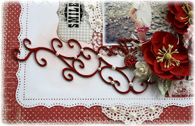
I added chipboard swirls from Dusty Attic and I finished them with a dark red paint and Glossy Accents to give them a deep rich shine. I also did a wee bit of background stamping and light inking with Prima's Moulin Rouge stamp and Versa Mark Dew Drops Ink. To complete the 'country' look I added just a touch of paper lace doilies and a bit of burlap (I love adding burlap for some nice texture!). Here are the supplies I used to create this page....

Supplies: Patterned Paper: Life in the Country (Summer Kitchen, Summer Kitchen-bs, Porch, Berries with Ice, In the Hammock-bs....don't you just love the names of the papers!!!), Dusty Attic Chipboard, Flowers: Prima (Primrose Sangria), Spellbinders die cut (Spiral Blossom #1), White blooms: Petaloo, Stamp: Prima (Moulin Rouge), Title rub-on: Daisy D's, Adhesive Pearls: Queen & Co. Ink: Versa Mark (Pretty Pastels Dew Drops).

Thanks for stopping by today and don't forget, I have a nice give-away going at my blog of the new Maja Design Spring collection called 'Vintage Spring Basics'. You can now view the full collection in the products section HERE (these papers are sooooo very beautiful!!!) If you want to have a chance of winning this gorgeous collection, check out this link before March 31st!  Gabrielles Blog

Here are just a few of my favourites from this new collection! So excited to start scrapping with these beauties!....


Tuesday, March 12, 2013

In the Mood for Spring {With Websters Pages 'Modern Romance'!}

I've pretty much had enough of winter now and want to just look to Spring.  And what better collection to do this with but Webster's Pages Modern Romance!  I love all the fresh and pretty florals in this collection.  For this page I did a whole lotta fussy cutting from one of my favourite papers from this collection, the one with all the floral tags (below)...
I basically just cut out a few of the blooms and used them as an embellishment by popping them out from behind the photo, giving them a little more 3D effect by using pop dots behind them.
  
For  the bottom corner I embellished using one of the NEW Websters Pages Perfect accents frames (it was a bright yellow, but I wanted something lighter so I just painted it white, I combined it with one of the older WP cameos.  The swirly chipboard is from Dusty Attic.
 
The photo is one of my great-niece Jade, doing a little coloring.  The photo put a smile on my face, so I wanted the layout to be more light-hearted, so I called it 'creative' giving the definition for creative being 'coloring outside the lines' lol!