Pages
▼
Wednesday, March 13, 2013
Like a Basket of Fresh Berries! {Maja Design ~ Life in the Country}
That's what I think of when I see the gorgeous selection of red patterned papers in the Life in the Country Collection ! I LOVE the dotty red paper and the beautiful scripted floral design paper, ... and the pretty gingham....it all makes me think of picking a basket of fresh strawberries in Summer! And I thought it would be the perfect collection of papers to compliment this happy picture of my little niece Jade, as she's splashing around in a creek.
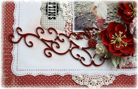
This would be my version of a more 'Clean & Simple' style of layout. My pages can often get very fussy and busy, but this time I thought I'd pair the pretty patterned papers with simple white card stock so that they really pop. Here are a few close-up details of the page...
I used some store bought Prima flowers and mixed them with a handmade bloom I made from the plaid paper called 'Porch', I used a Spellbinders die cut called 'Spiral Blossom #1' to make the bloom. I thought it gave the page a more home-spun appeal adding this flower.
I added chipboard swirls from Dusty Attic and I finished them with a dark red paint and Glossy Accents to give them a deep rich shine. I also did a wee bit of background stamping and light inking with Prima's Moulin Rouge stamp and Versa Mark Dew Drops Ink. To complete the 'country' look I added just a touch of paper lace doilies and a bit of burlap (I love adding burlap for some nice texture!). Here are the supplies I used to create this page....
Supplies: Patterned Paper: Life in the Country (Summer Kitchen, Summer Kitchen-bs, Porch, Berries with Ice, In the Hammock-bs....don't you just love the names of the papers!!!), Dusty Attic Chipboard, Flowers: Prima (Primrose Sangria), Spellbinders die cut (Spiral Blossom #1), White blooms: Petaloo, Stamp: Prima (Moulin Rouge), Title rub-on: Daisy D's, Adhesive Pearls: Queen & Co. Ink: Versa Mark (Pretty Pastels Dew Drops).
Thanks for stopping by today and don't forget, I have a nice give-away going at my blog of the new Maja Design Spring collection called 'Vintage Spring Basics'. You can now view the full collection in the products section HERE (these papers are sooooo very beautiful!!!) If you want to have a chance of winning this gorgeous collection, check out this link before March 31st! Gabrielles Blog
Here are just a few of my favourites from this new collection! So excited to start scrapping with these beauties!....


The red simply pop; I love it! A pretty layout Gaby!
ReplyDeleteHugs,
Asmah
Gabbi, this is soooo gorgeous! Love it!
ReplyDeleteThis is such a pretty page, Gabrielle! The bright reds make the photo really pop! Love it!
ReplyDeleteBeautiful layout, love the red script floral paper and the die cuts and wonderful.
ReplyDeleteThis layout makes me think of my own childhood, my grandmother used to knit things for me in red all the time. An absolutely gorgeous layout. Do you know where I can purchase the collection in Australia?
ReplyDeleteThis is just gorgeous, Gabi! Love the richness of the red against the white.
ReplyDeleteIt's such a lovely fresh lay-out! I really like how you used the red tones on this lay-out.
ReplyDeleteI simply can't wait to see what you will do with the new range too. It suits your style just really well!
Love the white zig zag stitch on the red dotted background!
ReplyDeleteOh this is absolutely gorgeous! What a very pretty layout with the red flowers and love the flourishes.. Love the hint of hessian too for contrast!! and those papers are very pretty too!
ReplyDeleteJust wonderful layout and beautiful details dear Gabrielle^_^
ReplyDeleteHugs,
Sonia
this is such a beautiful LO Gabi!! I love the bright reds!! those Maja papers look amazing, love that butterfly page
ReplyDeleteGabi, we don't see too many red l/o's from you :j, but when we do...WOW! they come alive!!
ReplyDeleteThis is gorgeous~ All the beautiful chipboard! and bright mix of 'toile' (?) and plaid - it's enchanting and fresh~ Thanks for all your tips and inspiration!~~
Loove how you've made the red dominate against the stark white! Amazing page!
ReplyDeleteGabrielle, I loved this layout so much that I lifted it, Credit go to you of course, I posted it on my blog here:
ReplyDeletehttp://scrapsylz.blogspot.nl/2013/03/1964.html