Sunday, October 24, 2010

Sketch Day at Bo Bunny!...and some Awesome Tombow goodies!


Bo Bunny linked up with Tombow this month so I got a nice little surprise pack in the mail full of really cool Tombow products including some neat adhesives that make it really easy to apply and reposition difficult items like pearl strands and ribbons! We were given a sketch to use to create a layout, so I used a combination of the Cambridge collection mixed with the Mama-razzi collection, along with some Bo Bunny stamps, rub-on's and blooms. The sketch was designed by Trisha Hill from Sketch Inspirations. Here are a few close-up shots of the above l/o...

If you'd like to see the sketch and give it a try yourself come check out this link at the Bo Bunny blog ~~> Friday Sketch Challenge and don't forget to share your l/o at the Bo Bunny blogsite to have a chance to win a nice prize of BB goodies!! And while you're there you can see the work of my awesome fellow designers sharing their take on the sketch!
Thanks for stopping by!
~Gabrielle xx

Monday, October 18, 2010

Timeless Chippies from Dusty Attic!


As soon as I saw this collection of beautiful Skeleton Clock frames from Dusty Attic, I knew they would be a favourite of mine! I've had these in my stash for a couple of months now and I only just now got a chance to use them on the weekend. These laser-cut clock frames are so cool because they come in 4 sizes in the one package....so happily I still have 2 other pieces to play with for other layouts! (below you can see the way the cut-outs come to you)....

The finish I gave the frame design is simply some gold metalic paint with a dab here and there with some turquoise color acrylic paint and a brush here and there with some white paint. I finished off the design with a pearl adhesive sticker on each hour spot of the clock. The blooms were mainly some gifts I've gotten in the past from a dear friend (thanks Pam!)...and the larger pink/fushia blooms are from Michaels from their Recollections collection. The papers are from a K&Company pad I had in my stash. Here are a few close-ups....


I called this l/o 'I Pick You' .....it's a play on the idea that my daughter is surrounded by all these blooms but from among all the pretties I still 'pick her'. She is such a smart and confident girl especially when it comes to 'smarts' but not as confident when it comes to her appearance...so I just wanted to make up a layout that makes her realize how special she is.
Thanks so much for stopping by!
~Gabrielle xxx

Wednesday, October 13, 2010

Double Layered Chippies from Dusty Attic!!


I was recently working on a l/o for a 'Grandparents' album for my mom and dad and scrapped this photo I took of Chloe a few years ago, since it was a photo my Dad really liked. I used this really cool double layered flourish chipboard piece by Dusty Attic that I'd been meaning to try out for a while now. I simply painted each layer seperately with some aqua color acrylic paint and some bronze metalic paint. I glued the two layers together (I used this new glue pen I got from Tombow to glue them together...it's awesome, great for glueing together detailed work). After the paint/glue dried I added a little bit of Distress Stickles in a Antique Bronze color....this gives the finished piece a flaked rust look when the Stickles dry. To finish it off I added some adhesive gems. The papers I used were from the My Minds Eye 'Lost & Found' collection. The blooms are Prima (thanks Pam!). Here are a few close-up detail shots of the page.....


Thanks so much for stopping by!! .....And if you have a moment, take a peek at the posts below for some fun contests and challenges that we are having over at MCS, the prizes are simply AWESOME!!
~Gabrielle xx

Tuesday, October 12, 2010

BIG CONTEST at MY CREATIVE SCRAPBOOK!!


Woohoo! It's contest time at My Creative Scrapbook!! And we all know Pam always puts together the most AMAZING prizes for her contests!! This will be a 3 month long 'Sketch' contest, inwhich each month you will be given a new sketch (created by Julie Bonner) to make up a l/o to enter the contest. The above pictured prize is the one that will be given for the first month (October)!! The prize winner will be chosen by the design team.....but don't despair if you are a new scrapper and aren't filled with confidence in your work.....there will also be 2 (TWO!!) extra DRAW prizes given each month too....so this is ANYONE'S game! ....The same will be happening for November and December (I'll post pic's of the November & December Prizes as the month draws near).....So there will be a total of 9 prizes given throughout the duration of the contest!! ....BUT! it doesn't stop there! If you choose to participate in each of the months sketch contests, your name will be entered into a draw for the EXTREME GRAND PRIZE pictured below......

So the above prize is again, anyones game as it is a DRAW prize!! For full contest details check out this link ~~> MCS SKETCH CONTEST
The Sketch for the Month of October is pictured below. I've also posted an example l/o I made for the October Sketch contest (I made this l/o with the September Main kit from MCS)......


You can find the above sketch for October and the Design Team example l/o's along with all the contest details for the first part of the contest at this link ~~~> OCTOBER SKETCH CONTEST ....This is the thread where you will post your layouts done with the October sketch....we will choose the winner of the October sketch from this thread.

So come join us for some fun creating with beautiful sketches and AWESOME Prizes!! We look forward to seeing all your entries!!

~Gabrielle xx

Friday, October 8, 2010

Photo tips: How to get a great self photo..

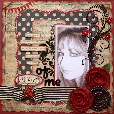
Here is the layout I made last month, in this l/o I listed things that I'd like to improve on (eating a proper breakfast, getting more exercise etc.)  I think that as scrappers we tend to stay behind the camera instead of infront of it and sometimes may shy away from getting our photo's taken.

Here are some tips on getting a good photo of yourself for your layouts and your avatar pics'.....

PHOTO TIPS:


I know that half the battle of this challenge will be getting a photo that we are happy with. Here are a few tips in getting a good shot:

~ OVER EXPOSE YOUR PHOTO ~ For the layout (above) I took a photo I was fairly happy with and decided to change it to sepia tones to coordinate better with the papers I used. BUT when I changed it to sepia, the small sun freckles on my face looked like an aweful rash!! To fix it I 'overexposed' the photo. This is an old 'Hollywood Glam' trick. You'll notice that in all the old B&W pic's of Marlynn Monroe, Rita Hayworth, Vivian Lee......mainly all you see are their main features.....eye's, nose, mouth....that's it! no blemishes, wrinkles, lines.....just blank clear skin. This is achieved by over exposing your photo. Most photo editing software will have a place were you can adjust the exposure. Just keep brightening the photo until you've achieved the look you want (you can also 'darken the darker area's' to get even more contrast).

~ TRY TAKING YOUR PHOTO FROM A SIDE ANGLE ~ taking a photo from a side angle can give a softer prettier look and will open up the eyes more. (I really don't have very large eyes, but in the photo above they 'show' well because of the side angle).

~ HOLD THE CAMERA HIGHER ABOVE YOUR HEAD ~ when taking a photo of yourself, hold the camera at a higher angle, this will reduce the 'double chin' effect that you may get with a head on shot.

~ LIP GLOSS ~ This is a trick I learned from Heidi Swapp!! She always carries a little bottle of lip gloss in her purse for photos (not just of herself but her children too!) ....I'm not talking about deep colored lip gloss, just something to add a little shine to the lips. I get my girls to put a little bit of a light pink lip gloss on before I take a portrait shot, you'd be surprised in the difference it will make to give a photo more 'life'!

~ TRY CHANGING THE COLOR TO BLACK & WHITE/OR SEPIA ~ Sometimes you might think a photo of you is 'okay' but you want something a little more glamorous. Try changing your photo to black & white or sepia (most photo-editing software have this feature...I believe you can also perform this task in Piscassa....a free online photo-editing site)

~ USE A WHITEBOARD TO CAST AN EVEN BRIGHT GLOW ON YOUR FACE ~ If you have assistance in taking your photo, this can be a nice little trick to get an even cool light on your face. Have someone stand in front of you holding a large piece of white board, beside the photographer (you can use a large piece of white bristol board for this) ....it will reflect a nice even light on your face.

~ CROPPING ~ For a different look, try cropping your photo in an unusual way. Cropping show that only half your face shows, or only your eyes, or a feature of your face that you really like!....this can give a nice 'artsy' look to your photo.

Hope this helps in getting us to see more layouts of my favourite people! Scrappers!! :)

                              ~~~~~~~~~~~~~~~~~~~~~~~~~~~~~~~~~~~~~~~~~

If you are up for a quick little challenge Bo Bunny runs a Friday Challenge every week. This week the challenge is to 'Scrap your Favourite Day of the Week/and Why' .....I chose 'Friday' as my favourite day.....Here is my l/o........

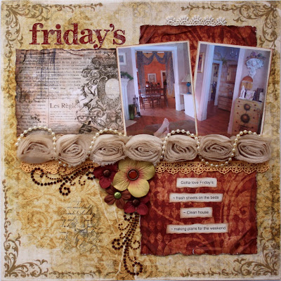
I picked Fridays because that's the day I have the house ready for the weekend.....fresh sheets on the beds (I just love my first night on freshly laundered sheets!), a clean house, and making plans for the weekend. I used the Bo Bunny Noel and Cambridge collection to make up this page along with the beautiful Chiffon Rose trim by Bo Bunny. I also wanted to give a mention to the adhesives I used on this page! TOMBOW sent the girls from Bo Bunny some amazing adhesives to work with this month! I used a liqued glue pen they make to attach my pearl trim to the BB Chiffon Rose trim and it worked like a charm! ......For more details on this challenge please check out the information at the Bo Bunny Blog today ~~> Layout Challenge Friday

It's time to challenge yourself!! Come join us for some fun and Prizes!!

~Gabrielle xxx

Monday, October 4, 2010

WonderFALL October kits from My Creative Scrapbook!!


It's that time of the month again!! Reveal day, at MY CREATIVE SCRAPBOOK!! I'll start with the LE (Limited Edition kit) this month.....I was so 'WOWED' when I opened this kit! Gorgeous papers and blooms but it's the trim's that really got me this month! Crochetted laces, applique trims, sheer/sequin trim and so much more! I've had this l/o knocking around my head for weeks now and it was fun to get the goodies to put the idea to paper! For this l/o I wanted a very loose/distressed/fabic looking design so I added touches of drybrushed white paint here and there, buttons and stitching. The circle stamps were simply the edge of the acrylic paint bottle cap stamped onto the page.
TIP: Take the time to actually sew your buttons onto a page, it makes a big difference to the finished look of the l/o!
Here are some close-up pic's .....


Another layout I made from this kit is one in which I used the circle die-cut paper....I just love the rich pretty florals in this paper! The photo is one that I took of my youngest daughter when we were on a Fall walk....
I made the white blooms from white and yellow cardstock.....I used the 'Water Distressed Blooms' tutorial I shared with you all a little while back. I cut 2 small jaggedy edges circles with a scissor from the white cardstock and then punch 4 very small 'daisy' blooms from the yellow paper. (I got my little little Paper Shapers retro daisy punch at Walmart for about $4.25 in the Craft Department....that little punch has come in really handy for flower centers)

NOTE: I also added an extra element of design to the flower by softly inking the center of the top white layer with some yellow chalk ink (I used Colorbox 'Wheat' color for this) Here are some close-ups.....
I made a 3rd l/o from this kit combining the Webster's Pages and 7 Gypsies papers (love these!) I braided 3 pieces of the green velvet trim to make this thicker border along the bottom of the page. The blooms are again handmade as above. The photo is one I took of my little great-niece Jade.
TIP: If you really like a certain element in your papers like the butterflies or leaves, blooms etc. take a color scan of them and print them out to use as cut embellishments for your page (this saves chopping up your papers too much and they can stretch a lot further)....here I scanned some of the leaf designs fromt the Webster's paper, cut them out, inked the edges and adhered them with pop-dots....
And finally a 4th l/o I made with this kit, I used some of the soft aqua colors in the kit. The photo is another that I took of my youngest on our walk. The butterflies are made from the Prima Packaging (the card of paper the Prima blooms were attached to) ....you can find my picture tutorial for this here ~~~> Embossed Butterflies
The brown felt flourishes were actually from a set of Prima gates in the kit that I took apart. (Check out the work of the rest of the DT to see the gates used in full....
Another amazing kit I got to work with this month is the beautiful Main kit. Talk about colorful! and so many wonderful die-cut embellishments to work with. Again, I just love the trims and little extra's in this kit (the green ruffle ribbon is just gorgeous IRL!) Here is the first l/o I made with this kit...

I wanted to make the flower accent on the page resemble the flower on my daughters dress, so I extended the medium size Prima rose with some (water-distressed) cardstock petals.....


I just love all the rub-on's, lace and other goodies in this kit!....for a 2nd l/o for this kit I picked up the smokey plum colours in the kit and played some pinks against it. I took this photo of my oldest daughter Chloe when she was kind enough to pose for me when I made a whimsical hairband for Bo Bunny.....
All the blooms are from the kit, except I made the large pink on using one of the small blooms in the kit and some plain pink cardstock (I again used the Water Distressed flower technique for this ...I gave it a little extra twist by lightly curling the edges of the petals in with my finger tips when I opened up the wrinkled balls of paper). I also made the butterflies from the Prima packaging that came with the blooms in this kit (see my Embossed Butterflies Tutorial for more information on this) Here are some close-ups...
For my 3rd l/o for this kit I played with the fun die-cut sheet that coordinates with the papers in this kit. I dressed the lamp up with some of the trims found in the kit and the large green bloom was made by wrapping some of the green trim in a spiral shape and sticking it to a piece of cardstock with glue, I then finished it with a vintage looking button also found in the kit. Here is the l/o with some closeups....


And last but certainly not least, another gorgeous kit I got to work with was the Album kit from MCS!! I knew that Pam had ordered these papers for the album kit a couple of months ago and just couldn't wait till the October kits got here so I could have a go at them! The black/red/tan colour combination in this kit is so striking and elegant and the trims and blooms she put with it were so beautiful (all the DT girls just went mad for the stripped ribbon!!) Here is my first l/o for this kit....
I think as mom's we tend to put everyone else first and we feel that we are being caring and unselfish....but in reality it's really important to take care of ourselves too! This came home to me last month as I was battling strep throat, I realized I don't take enough time to take care of me. This page was a reminder to me, to get good rest, good exercise and eat well too! Here are a couple of close ups of the goodies on this page (check out the cute black lace/gem flourish from Prima...YUM!)....


Another l/o I made using these beautiful glittery papers is this one about my daughters and the way they dress themselves. These papers had a Parisian flair with their french script and the pic's of the Eifel Tower so I went with a french title "Haute Couture'....meaning 'High Fashion'....I have to smile when I see their stripped leggings and cute hats....

I just love the unique and pretty floral cluster Pam included in this kit, it's made up of blooms, seed beads, gems, feathers and lace! Here is a close-up pic....

And finally a 3rd l/o I made with this lovely kit was a l/o of my dear husband and I. We still had our sweet Mocha at the time (Chloe took this pic of us last fall when we went on a little outing....Steve had to hold Mocha back because we were on a beach and there were ducks scampering about on the shoreline :) ....

I made the roses and bloom from the patterned papers in the kit. I used the 6 Petal Punch Bloom tutorial I shared with you last year for these blooms. Here are a few close-up shots....


I know it was another super long post but I hope you were able to get some helpful tips and ideas for your own pages. I just want to say thanks so much to all the wonderful followers I have at my blog, I read every one of your comments and really appreciate your input!

Happy Scrappin'!!

~Gabrielle xxx

LinkWithin

Related Posts with Thumbnails