It's another gorgeous palette to inspire you over at The Color Room! This weeks palette (#79) is a lovely combination of a soft rosey plum, a warm caramel, a dove grey and a hint of muted teal. Here is the inspiration for the palette....
I always love to challenge myself to see if I can find all the colors I need from my old stash and get the colors as close to the palette as I can (you should see me with my computer screen up and holding all my items against the screen! lol! It makes me happy to know that I'm using up product that I already have. I think I managed it! But I have to admit that I used new product in the Dusty Attic piece's I used (but at least I didn't go out and purchase anything new for this page! yay!) The basic rules of the Color Room is to use all the colors in the palette (only) and you can also use neutrals with it (like white, black or craft paper).
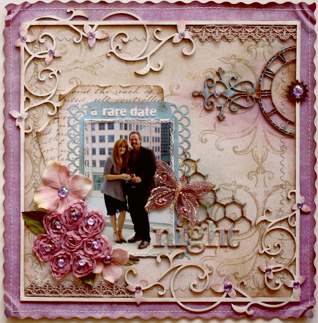
This page is to represent one of the few date nights my dear husband and I manage every once in a while. We tend to do so much as a family but it really is nice to get out just the two of us sometimes. Here we were at a party for Steve's brother in downtown Toronto (the CN Tower was directly behind us in the photo but my BIL took the photo at the wrong angle). The food was crazy AWESOME!! .....here are a few close-ups of the page elements.....
For the above piece I added a little piece of the Dusty Attic Chicken Wire (one of my favourite pieces, it's so versatile) and below you can see a corner of the intricate new Sweat Pea Frame design from Dusty Attic. If you are looking for Dusty Attic products, just look to the right of my blog site, I've listed a bunch of the retailers there for your convenience.
As for the rest of the supplies, I used some BasicGrey Kioshi (the mauvy background frame paper), The script paper and flourish paper are both Recollections (from Michaels), The teal paper is Tim Holtz, The lace, butterfly and ribbon bloom is Prima. Gems are Recollections. The chipboard alphas are Bo Bunny from the Et Cetera collection. If you want some tips on how to do the Verdigris Aged Patina that I added to the flourish and clock you can check out my tutorial by clicking on the words (or find it on the rightside column of my blog. Come join us in the challenges over at The Color Room, give the above palette a try and remember to post your layout in the gallery there, you might just get featured in next weeks newsletter!


